
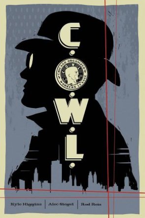
C.O.W.L. #1/ Written by KYLE HIGGINS & ALEC SIEGEL/ Art by ROD REIS/ Published by IMAGE COMICS
In a world full of dangerous vigilantes who do just as much damage as the evils they claim to protect against, only one group offers true protection and accountability – C.O.W.L.! The Chicago Organized Worker’s League is the world’s first Super-Hero labor union and the vanguard in local defense of the Windy City. From spy-smashing to fiend-foiling, C.O.W.L. takes care of it all!
In times past C.O.W.L. faced many a dangerous foe – everything from mobsters to mad scientists. But now C.O.W.L. faces its greatest challenge ever – public indifference! For many wonder if superheroes are truly relevant, as most of the great villains are in jail or in hiding. And many within C.O.W.L. have grown cynical about the group, their co-workers and their mission…
Kyle Higgins and Alec Siegel first came to prominence because of a short film they created as part of Higgins’ senior thesis. The League was a period piece set in the Chicago of an alternate 1960s, where superheroes were real and a super-powered serial killer was on the loose. The film got the attention of some bigwigs at Marvel, which led to the two working on a Captain America project together and Higgins later going on to write Nightwing at DC Comics.
Today, Higgins and Siegel are raiding their old toybox, bringing characters from The League to the comics page in this new C.O.W.L. series. In a recent interview, Higgins said he was inspired to return to this world because of a desire to expand upon the basic premise only hinted at in The League. “We really only used the idea of a superhero labor union as a backdrop,” said Higgins, who further explained that the new C.O.W.L. comic is intended to explore “what this organization is. How it operates, who’s in it, etc.”
 Unfortunately, C.O.W.L. fails to live up to the promise of its premise. Nothing is said of labor unions in this issue and there’s nothing that really distinguishes the team we see from any other superhero group in terms of its operations, save that the leader wears a suit instead of a cape and their headquarters is a dingy office building rather than a watchtower on the moon. The story also fails to take advantage of its time period, with the only hints to the story taking place in the 1960s being the black-and-white television sets and the fact that drinking in the middle of the workday is perfectly acceptable.
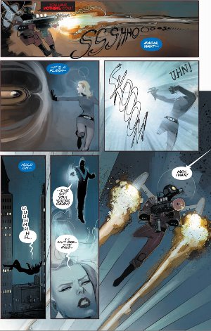
The artwork by colorist Rod Reis is another strike against this series. It seems that Reis tried to copy the style of Darwyn Cooke and failed horribly. The visual aesthetic of this book is all over the place. Many of the characters lack defining inks and appear as vague blobs defined by only a few specs of color. Other characters are drowned in shadows and heavily over-inked. Frequently this happens on the same page!
On the whole, there is little to recommend C.O.W.L. #1. The story fails to utilize its concept or its time period, the characters are shallow and the artwork is an overall mess. Those who are interested in a retro superhero story detailing a society adjusting to an organized superhero group would do well to look up the Eisner, Harvey and Shuster winning series The New Frontier.


I wonder if these bad sides to the comic are just the unfortunate planning of a first issue and it will get better, or if it’s just not what everyone was hoping for.
LikeLike
I don’t know. But i don’t plan to waste time buying Issue #2 to find out.
LikeLike
Wow, what a presumptuous review. You act if EVERYTHING was supposed to be laid out on the table in the first 20 page of the series. And Reis tried to copy Cooke’s style? What? Anyone with two eyes can see it looks nothing like Darwyn. Cooke. Just a terrible review.
LikeLike
> You act if EVERYTHING was supposed to be laid out on the table in the first 20 page of the series.
Maybe I’m old-fashioned in that regard – thinking a first issue should actually involve the unique aspect that was used to promote the series as something new and never-before-seen. (i.e. unionized superheroes).
> And Reis tried to copy Cooke’s style? What? Anyone with two eyes can see it looks nothing like Darwyn. Cooke.
Hence the word “tried”. And the supplemental “and failed horribly”.
LikeLike
After reading your review, I went and read C.O.W.L. #1 for myself and ended up really enjoying it. I don’t doubt that I went in with lower expectations after reading your review, so that may have played a part.
Though I also wonder if you were expecting more when you went in to C.O.W.L.# 1 and that’s where you’re disappointment stemmed. Knowing about Higgins’ and Siegal’s short film, it’s almost as if you’ve read a first issue for this premise and world and so the actual first issue didn’t offer you anything new.
I’m not saying your criticisms aren’t valid as it can be frustrating to pay $3+ for only a fraction of the story. I’m sure that’s why so many still prefer to read these stories as collected editions. But if you didn’t know ANYTHING about C.O.W.L. or this alternate Chicago with heroes and villains running around, then I think this first issue did just what it needed to spark interest.
And again, this is obviously all a matter of opinion but I like Reis’ art, but then again I’m fan.
But I’ll tell you what, I’ll review the second issue and let you know if it’s worth giving another shot.
LikeLike