
CAPTAIN CARTER #1/ Story by JAMIE MCKELVIE/ Art by MARIKA CRESTA/ Color Art by ERICK ARCINIEGA/ Letters by VC’S CLAYTON COWLES/ Published by MARVEL COMICS
It was, perhaps, inevitable that we should see a Captain Carter series. Given that, it is surprising that it has taken so long, when she was one of the breakout characters of last year’s What If animated series. (She is also, if rumor can be believed, about to appear in live-action in the upcoming Doctor Strange sequel.) The biggest surprise, however, is that this series centers around a new version of Captain Carter.
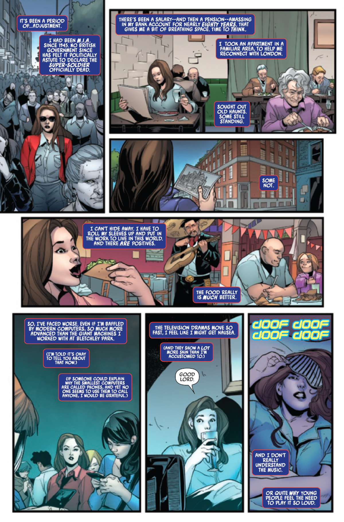
The story by Jamie McKelvie is quick to establish how this version of Peggy Carter is different from the one we’ve seen before, having been frozen in the Arctic ice for 80 years before being revived, like the classic Captain America. Most of the issue details her trying to rebuild her life and acclimate herself to how much England and the world have changed in the 21st century. The British government, however, is anxious to get her back into action, as there’s apparently a superhero power gap on the world stage. This doesn’t interest Peggy until she discovers that Hydra is still a power to be bested in this brave new world.
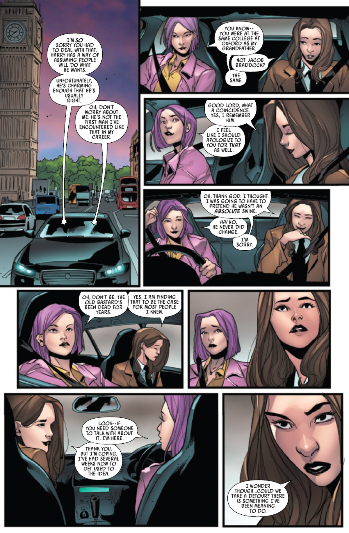
McKevie’s script focuses on introducing this version of Peggy Carter as a character and slowly building the world around her. We learn that this Earth has a Fantastic Five, but that is incidental to Peggy’s interactions with her upstairs neighbor and Agent Elizabeth Braddock, who is assigned to be her handler. This adds depth to the series, but action fans should not despair. There’s also ample opportunity for Captain Carter to kick Nazi arse.
The action scenes in this issue look amazing, but Marika Cresta keeps the camera shifting even in the static scenes of two characters talking. This conveys a subtle sense of motion to the story, which helps to maintain the readers’ interest visually. Not that there’s much danger of them getting bored! The colors by Erick Arciniega are also impressive and VC’s Clayton Cowles does his usual excellent job on the lettering.
Captain Carter is here and it’s about time! Put simply, this is an engaging series and it is one I plan to read on a regular basis in the future. More than a simple distaff take on a classic formula, this is an enjoyable, adventurous title centered around a strong, smart hero that everyone can enjoy.

